What Kind of Handwriting Are You? SEVERANCE Edition
(There are NO Season 2 Finale Spoilers in this post.)
Clearly, I’m still thinking about the Season 2 finale of Severance, so I’ve created writing samples that I think reflect the personalities and appearances of the main characters. Note that while I support the idea that Innies have lives of their own, I don’t think their handwriting would be different from that of their Outies.
Gemma | Flourished Copperplate Script
Why: Gemma is exquisitely beautiful and you can’t stop looking at her. When she first appears (Season 1) as Miss Casey, she’s donning a crisp white collar, and her black hair is in a long, wavy bob — simply stunning. And though she’s forced by sinister Dr. Mauer to wear a variety of outfits that evoke different terrors and eras, she always looks classic.
Helly | Roman Italic

Why: Helly is strong and courageous, not overly precious or embellished, and has demonstrated her loyalty and dependability. Confident and easy to get fired up, she’s a ride-or-die kind of woman…like the Empire and the City this handwriting was named for, Helly’s an eternal friend.
Mark | American Cursive

Why: Because he seems like a sweet schoolboy – good at completing tasks and (for the most part) following rules — I’m assigning American Cursive to him. It’s basic and unassuming. I mean, Mark does have great hair, but he’s not overly concerned about his appearance. Like Mark, American Cursive gets the point across in a no-nonsense way.
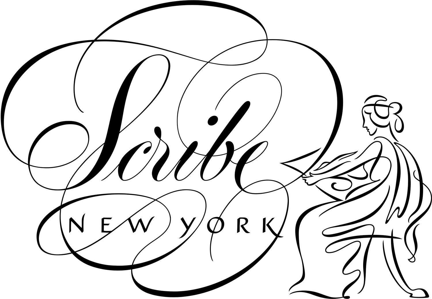
Irv | His Own Personal Handwriting

Why: The note behind the picture in the break room shows us exactly how Irv writes. If he were to compose a poem for Burt, perhaps Irv would commission Scribe New York to pen it in illuminated lettering for him, but he’s not too concerned about his everyday writing. To be fair, I think he’s written the directions to the black hallway under a bit of stress, which would explain the sloppiness.
Dylan | His Own Personal Handwriting

Why: Same as Irv, we’re treated to an actual sample of Dylan’s handwriting in the Season 2 finale…in fact, I learned that actor Zach Cherry wrote the note himself. For the purposes of the show, it was Outie Dylan who wrote the note. Because he struggles with routine and doesn’t seem to prioritize neatness, it makes sense that his writing lacks cohesion and order. And if Outie Dylan and Zach Cherry have the same writing, I’m going all in on Innie Dylan matching theirs.
Milchick | Spencerian

Why: Developed in the mid-1800’s in America as a way to make business correspondence more legible and personal writing more elegant, Spencierian is a sweeping style featuring beautiful, flowing lines. Milchick’s super fly leather outfits and the elaborate ivory getup worn at the Outdoor Retreat Team Building Occurrence tell me he’s a man who cares about his looks. He’d constantly be thinking of new ways to flourish his name using Spencerian ornamentation, like birds and floral bouquets.
Cobel | Gothicized Italic

Why: Needs no explaining. This is a situation where lettering speaks for itself, so l’ll only say this Gothic hand signals a lot of things, both good and evil, and is well-suited to someone who said, “If you want a hug, go to hell and find your mother.” What I will miss most about Cobelvig is her oddball speech patterns… I would like to have her saying “Maaukk” on loop so she can keep me company between now and Season 3.
Miss Huang | Modern Script

Why: She wants to be one of the cool kids but instead, she’s Deputy Manager of the Severed Floor. Miss Huang’s ring toss toy is evidence that despite her responsibilities, she’s still a child. I think she would love the loopy, loose vibe of a modern hand. And cultish as Lumon is, I don’t think Miss Huang would scribble her name as “Miss Huang;” she’d instead use her first name. The heart would be a subversive act of expression for her adolescent dreams that don’t see the light of day at Lumon. And SHE won’t be seeing much light, either, now that she’s relocated to Svalbard, Norway…